The Derivative Payoff Bias
A +2 Sharpe idea. Does it still work after going public?


The idea
“You're nothing but a pack of cards!” Alice, standing up to the Queen of Hearts.
I used to think Alice in Wonderland was just a goofy kids’ story.
After re-reading it as an adult, I actually think it’s brilliant.
It’s satire dressed up as nonsense. A dream disguised as a joke. A mirror hiding in plain sight.
The White Rabbit? That’s obsession and urgency. The Queen of Hearts? Power and chaos. Every character says something about the world, and about us.
That’s why I’m kicking off this week’s piece with Lewis Carroll’s trip down the rabbit hole. Because two of those symbols tie directly into what you’re about to read. You will see in a moment.
This week, I decided to implement and share my code for the paper “The Derivative Payoff Bias” by Guido Baltussen, Julian Terstegge, and Paul Whelan.
To be honest, I almost skipped it. A few smart people (people I respect) said the strategy stopped working after the paper came out. One trader even posted a backtest showing the edge had vanished. I thought, Maybe he’s right. Who am I to question it?
But then I remembered something: even the sharpest minds can be wrong. Maybe his implementation was just a pack of cards. So I dug in and ran it myself.
In fact, I’m sharing my code so you can run it too. If I made a mistake, someone will call it out. One of the perks of working in public.
Following the White Rabbit is one of the most powerful ideas in Alice in Wonderland. This means chasing curiosity down uncomfortable paths. If you're reading this, I know that instinct lives in you, too.
So consider this your invitation to follow the rabbit.
Now, let's be specific. Our curiosity demands answers to these simple questions:
Is this paper legit?
Did this anomaly stop working after publication?
Should we trade this anomaly?
Here’s the path down the hole:
First, we’ll summarize the paper
Then, we’ll replicate the chart that reveals the anomaly
Next, we’ll statistically compare how the market evolved after publication
Then, we’ll implement the strategy and share the results
Finally, we’ll discuss possible next steps
Let’s get to it.
We’re building a private community for systematic traders. A place to explore ideas, exchange insights, and tackle the real technical and strategic challenges of building robust trading systems… from signal research to execution and risk.
Enrollment reopens in August. Join the waitlist below to be the first to know when new seats open:
Paper Summary
“The Derivative Payoff Bias” uncovers a persistent and predictable price distortion in U.S. equity index derivatives. It shows that the way certain derivatives are settled, using the opening price on the 3rd Friday of each month, creates a systematic bias that favors some traders and penalizes others.
Core Idea
Many index options and futures on the S&P 500 expire using the Special Opening Quotation (SOQ), based on the opening prices of the index components on the 3rd Friday of each month.
Since around 2003, the SOQ tends to be systematically higher than the prior day’s close, leading to inflated payoffs for certain derivative holders.
This effect, called the “Third Friday Price Spike” (3FPS), shows prices drifting up overnight into the SOQ window, then reversing intraday.
The result:
Call buyers win (higher-than-expected payoffs)
Put buyers lose (lower-than-expected payoffs)
The estimated annual wealth transfer is ~$3.5 billion in favor of call buyers and against put buyers and call writers.
Why Does This Happen?
The effect is not explained by news, earnings, macro events, or pinning to strike prices.
The most plausible cause is dealer hedging behavior, specifically driven by a Greek called Charm (the rate of change of delta over time).
As expiration approaches, dealers adjust their hedges based on Charm, which creates buying pressure overnight and pushes prices up into the SOQ.
This demand imbalance is strongest on Triple Witching days and off-quarterly expirations, when hedging activity is heaviest.
Evidence shows that the more negative dealers’ Charm, the more positive the price drift overnight.
How to Exploit It
The pattern is highly consistent and tradable:
Go long at Thursday close
Reverse to short at Friday open
Close the short before Friday noon
This creates a tent-shaped return pattern that captures the overnight drift and avoids the intraday reversal.
The strategy produces statistically significant returns, even after transaction costs.
The effect is isolated to a.m.-settled contracts — p.m.-settled options show no such bias.
Traders can monitor net Charm positioning from market maker data to anticipate when the price spike is strongest.
Down the Rabbit Hole
I love insightful charts. They often say more than words ever could.
In fact, I believe that truly powerful ideas can often be captured in a single, well-crafted chart. In the case of the paper we’re exploring, that chart is the very first one on page 2:

This chart shows how S&P 500 E-mini futures behave overnight. On regular days (red line), prices move slightly. But on 3rd Fridays (black line), prices spike up overnight, and drop sharply right after the market opens at 9:30 a.m. (blue line). The pattern is clear, consistent, and striking.
I thought: what an elegant, simple, and powerful way to explain the paper’s core idea.
Can I replicate it? I wondered. That chart was my White Rabbit — and down the hole I went, chasing the anomaly. :)
Data
To replicate the chart above, we need OHLC minute-level data.
Databento is a cost-effective source. Downloading NQ and ES price data (first and second continuous contracts since 2010) costs less than $50.
But Carlos, why bother getting data with such granularity? Doesn’t the paper use open and close prices to compute the strategy’s performance? For that, isn’t end-of-day data enough?
Ah… First, it’s impossible to replicate the chart above using daily data.
But more importantly, what if trading at 9:20 a.m. turns out to be more profitable than trading at 9:30?
I can imagine less curious people settling for end-of-day data, skipping the effort of replicating the chart, and just running the strategy on low-granularity inputs. I can also imagine that path leading to inferior results.
But we’re down the rabbit hole now. And that usually means going after high-quality data. Doing things most people aren’t willing to do.
As they say, garbage in, garbage out.

This code loads and processes 1-minute OHLC data for the first and second E-mini S&P 500 futures contracts from Zstandard-compressed files stored locally. It reads the data using Databento’s Python API, concatenates it into a single DataFrame, and sorts it by symbol and timestamp.
Next, we need to decide when to use the first- or second-month contract.
We’ll use the first-month contract whenever there are more than 5 days left until expiration.
Otherwise, we’ll switch to the second-month contract.
To do this, we need the expiration date of each specific contract.

This code retrieves the expiration dates for each futures contract in the dataset. First, it identifies the start date of each unique instrument_id (i.e., when each contract first appears in the data). Then, using the Databento API client, it queries contract metadata — including the symbol and expiration date — from the GLBX.MDP3 dataset, starting from each contract’s first appearance. All responses are combined into a single DataFrame, and only the relevant columns (instrument_id, raw_symbol, and expiration) are kept for later use in determining which contract to use based on time to expiration.

The snippet above finally constructs a continuous minute-bar price series by selecting the appropriate futures contract based on time to expiration.
The result is something like this:

Next, we need to pre-process this DataFrame. What are we aiming for?
Simple: we want a table where:
Each row represents a 5-minute interval from 4:00 p.m. ET on one day to 4:00 p.m. ET the next day;
Each column represents a different date.
The values are the log-returns from that moment to the first row.
Then, we’ll extract a subset of that table containing only the 3rd Thursday-to-Friday periods.
Let's do that.

The snippet above prepares the groundwork for identifying specific day-pairs and calendar-based filters. First, it creates two aligned date series: d0, a list of all unique trading days in the dataset, and d1, the next day for each d0 (i.e., the day-pair). Then, it builds a list of all 3rd Thursdays in the calendar range covered by the data.
Now, the most important code of the article:

This code builds two return matrices: one for all trading days and another for 3rd Thursday-to-Friday sessions only.
For each day-pair, it constructs a 5-minute interval time series from 4:00 p.m. ET to 4:00 p.m. the next day. It then calculates the log-returns from the start of that window and stores them in a standardized format where each column is a date and each row is a 5-minute offset from the start. Days with too much missing data are skipped.
The result is a clean, uniform dataset of intraday return curves, ready for comparing anomalies across regular days vs. 3rd Fridays.
Visualizing
We can now plot Figure 1. First mission accomplished.


The chart has approximately the same shape as the one presented by the authors.
As Josh Starmer would say, bam!
Statistical significance
Careful readers will notice a small (but important) detail:
Instead of using 9:30 a.m. as the cut-off time, I’ve chosen 9:20 a.m.
As my intuition suggested, there’s actually a better time to trade this anomaly.
Now, let’s check how many basis points we earn by being long from 4:00 p.m. to 9:20 a.m., and short from 9:20 a.m. to 4:00 p.m.
And most importantly, let’s test whether these returns are statistically different from zero.


Returns around 3rd Fridays are meaningful. Double-bam!
There’s just one small wrinkle: the t-stat on the long leg is 1.7, a bit below the threshold of 2 that we typically look for when assessing statistical significance.
I’d say that’s a minor issue, especially considering we’re analyzing data from 2010 onward, while the authors used more than twice as much data. (More data = lower standard error.)
With that said, we can confidently say that yes, the paper is legit.
Now, let’s go further down the hole and answer the second question:
Did this anomaly stop working after publication?
Before and After Publication
The paper was first published on September 20, 2023.
First, let’s visualize the intraday return patterns around the 3rd Fridays of each month:


As expected, before publication, the returns are consistent with what we’ve seen so far.
However, after publication, the return profile looks quite different.
Adjusting the cut-off time to 9:15 improved the results slightly… but it didn’t fix the problem.


The tables confirm the bad news.
After publication, the mean return on the long leg is 0.7 bps, while the mean return on the short leg is -2.6 bps. Both minimal.
The t-stats, close to zero, show that these returns are statistically indistinguishable from zero.
So, that's it. The anomaly stopped working after publication. The Queen of Hearts wins… right?
NQ to the rescue
Not so fast. The paper mentions that the anomaly also appears in other index options and futures using the Special Opening Quotation (SOQ).
Before we call it a day, let's check the numbers for NQ.
After all, we are compulsively curious. Down the rabbit hole we go.
Before publication


Here, we get a better picture than with ES: returns are stronger on both the long and short legs.
And the t-stats confirm that they’re all statistically different from zero. Double-bam!
After publication


But this is where our curiosity pays off:
Although the return chart looks odd, the mean returns are clearly different from zero on both the long and short legs: 7.8 bps and -15.1 bps, respectively.
I know, the t-stats aren’t above 2.
But here’s the key: we only have 20 samples post-publication.
So, this non-significant result may simply be due to insufficient data. Not because the edge has disappeared.
There's even another test we can run: compare the strategy's returns before and after publication.
Strategy returns
Getting the strategy's daily returns is pretty straightforward:

I am using the same 3 bps of trading cost as assumed by the authors.
Now we can check the return distributions, expected returns, win rates, and more — for all trades since 2010, before and after the publication date.
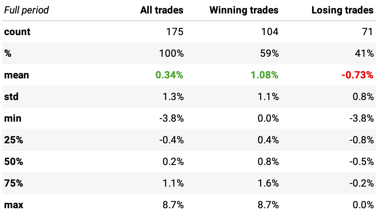

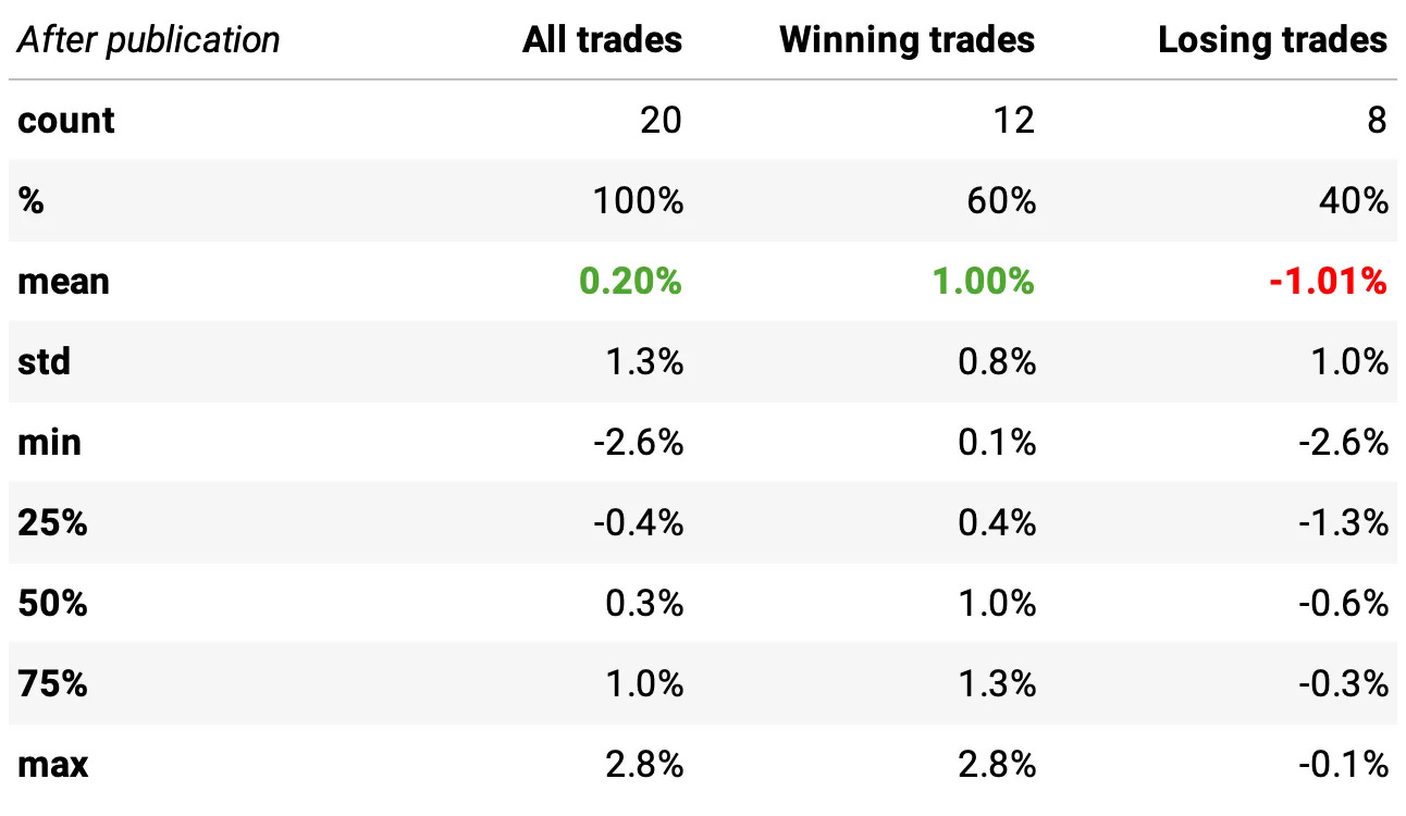
In summary:
The strategy performed consistently well before publication, with strong average returns and good win/loss dynamics.
After publication, results weakened, but small sample size limits our ability to draw hard conclusions.
The edge may have decayed a little, or we may simply need more post-publication data to confirm if it’s still alive.
As a final test, we want to compare the returns before and after the paper’s publication to see if there’s a statistically significant difference between the two periods. To do that, we run a two-sample t-test with unequal variances (equal_var=False) using the returns from each period.

The result: t-stat = 0.51 and p-value = 0.61.
This high p-value indicates that we cannot reject the null hypothesis: the returns before and after publication are statistically indistinguishable.
In other words, while the post-publication performance looks weaker, the difference could simply be due to random variation, especially given the small number of trades after publication.

This strategy, unleveraged, generated a total return of 81% over the full period, or about 4.1% per year. The maximum drawdown was 6.0%.
Those numbers may not seem like much. But they’re actually quite impressive when you remember they’re achieved by trading only 12 times per year.

If we had traded this strategy since 2010:
We would have had 2 negative years;
We would have seen 61% of the months positive, with the best at +9.1% (Mar'20);
We would have seen 39% of the months negative, with the worst at -3.7% (Mar'22);
The longest positive streak would have been 10 months, from Jul'19 to Apr'20;
The longest negative streak would have been 4 months, from Jul'16 to Oct'16.
Sharpe ratio
We compute the annual Sharpe ratio by scaling the daily excess return to volatility ratio by 12 trading periods, just as the authors did in the paper:

However, although we have Sharpe ratios above 1.5 in 4 out of the 16 years analyzed, our full-period Sharpe is 0.9.
This is less than half of what the authors reported in the paper.
Why? Because our sample covers only the post-2010 period, while the authors use data starting in 2003. This gives them more trades, lower estimation error, and stronger average returns.
Final Thoughts
So, did this anomaly stop working after publication? Not quite. But it clearly weakened. The performance dropped, t-stats shrank, and the beautiful pattern seen in the pre-publication charts became noisier.
Still, with such a small post-publication sample, it’s hard to say the edge is truly gone. What we can say is that it’s no longer the clean, obvious trade it once was. The crowd may have caught on.
Should we trade this anomaly? Not by itself. The edge has weakened since the paper was published. But the results don’t argue against including it as part of a broader system, alongside other strategies in a well-diversified portfolio.
We opened with Alice standing up to the Queen of Hearts… and for good reason. The internet is full of Queens of Hearts: bold claims, confident charts, and loud opinions that go unchallenged.
But sometimes, they’re just a deck of cards.
It’s our job to question, to test, and to reason for ourselves. And to do that, we have to follow our curiosity. Follow the White Rabbit.
As always, I’d love to hear your thoughts. Feel free to reach out via Twitter or email if you have questions, ideas, or feedback.
Cheers!
The first cohort of the course was a great success. Thank you to everyone who joined!Enrollment is now closed. The next cohort opens in August, with 50 more seats.Course participants also get exclusive access to our Community and Study Group.Join the waitlist below to be notified when enrollment reopens:
(I know, I need to update this landing page… as soon as I find time I will add more details about the course, the community, reviews from the 50 first users, etc :))
I plan on sharing a summary of this on the Options Omega thread in Discord with full attribution to you. It's a group of mostly independent quantitatively oriented options traders. Really nice work, thanks..
Where do you find these papers? Is there a journal? Or an index or a source that you could recommend besides just scraping for the latest ones?